Saturday, June 07, 2025

Is this the future of Street View?

Odyssey has released a demo of its new AI technology that enables users to explore 3D video environments in real time.

Odyssey is similar to Google Maps Street View in that it allows users to visually explore real-world environments. However, instead of navigating through static 360-degree photos, Odyssey uses AI-generated streaming video that responds dynamically to user input.

The result is a much more interactive and immersive 3D world - like stepping into a living, evolving version of Street View, where the environment can change and unfold as you move, almost like a video game. Unlike Street View, which relies on stitched-together images, Odyssey’s model generates new video frames on the fly, simulating realistic motion and spatial consistency in response to user movements.

The Odyssey Interactive Video demo includes a number of 360-degree scenes that you can freely explore. Most reviews I've read emphasize its potential for creating 3D worlds for games. However, I think there’s also clear potential for this technology to enhance mapping, for example as an advanced Street View layer. Currently, the interactive 3D environments produced by Odyssey are fairly low in resolution, though generally clear. It would be interesting to see whether the technology could generate higher-resolution models if it were trained on Google Street View imagery.

Via: Webcurios

Friday, June 06, 2025

Mapping A Billion Birds

The ADS-B Massive Visualizer now maps 1.5 billion eBird observations. This powerful, interactive geospatial tool shows where and when different bird species have been observed by eBird users around the world.

At first glance, the map may look like just a collection of dots - but click the selector button (the square with an arrow in the bottom left corner), and you can draw a region to explore in more detail. A sidebar will appear, listing all the bird species recorded in the selected area. For example, around my own neighborhood, the map reveals sightings of the Common Wood Pigeon, European Robin, Rock Pigeon, Eurasian Blackbird, Great Tit, House Sparrow, Eurasian Blue Tit, and Black-headed Gull (though oddly, no Parakeets or Magpies).

The map also supports filtering results using ClickHouse SQL, a dialect of SQL designed specifically for the ClickHouse database. It can be a little tricky to use, but I was able to run a few queries by selecting some of the provided examples and simply replacing the 'vernacularname' with the common name of the bird species I wanted to visualize.

The ADS-B Massive Visualizer also allows you to explore a number of other large databases. These include Planes (130 billion records), Places (from Foursquare), and Photos (seemingly sourced from Flickr).

Thursday, June 05, 2025

Mapping Whale Superhighways

The WWF has launched a new interactive map Blue Corridors that brings 30 years of whale migration data to life. Using the map you can:

🛰️ See where whales travel.

⚠️ Learn what’s putting them at risk.

💙 Discover how we can protect them.

The new Blue Corridors interactive map is designed to support global whale conservation efforts by visualizing decades of scientific data in a way that is accessible, actionable, and urgently relevant. At its core, the map transforms over 30 years of satellite tracking and research into a compelling, interactive experience that allows you to explore whale migration routes, pinpoint major threats, and examine conservation priorities across ocean basins. 

The map is built on 1,429 satellite tracks and over 3.2 million kilometers of migratory data and integrates inputs from more than 50 different research institutions. The platform overlays whale movements with human activities such as shipping, fishing, and pollution to identify high-risk zones, supporting data-driven decisions to mitigate threats like ship strikes and entanglements.

You can interact with the map by species, threats, or regions. The sidebar menu also includes links to news and stories about whale conservation, whale migratory routes and the threats to marine environments.

Wednesday, June 04, 2025

Canadian Wildfire Smoke Forecasts

The wildfires currently raging in Canada have forced the evacuation of over 25,000 people across Manitoba, Saskatchewan, and Alberta. Manitoba has been the hardest hit, with entire communities like Flin Flon and Cranberry Portage forced to flee. The smoke from the wildfires is now affecting air quality not just in Canada, but in several U.S. states.

You can use Smoke Forecast to view BlueSky Canada smoke forecasts on an interactive map. These forecasts are produced by the Weather Forecast Research Team at the University of British Columbia, with support from multiple agencies. Utilizing information on fire locations, sizes, and atmospheric conditions, the map shows areas likely to be affected by wildfire smoke and estimates associated smoke concentrations.

Using the map, you can view hourly, daily average, and daily maximum ground-level PM2.5 concentrations - the fine particulate matter that poses significant health risks, especially to vulnerable populations. These forecasts can help individuals and public health agencies prepare for and respond to poor air quality conditions by providing timely, localized data. 

The Canadian Wildland Fire Information System's Interactive Map shows the current danger levels across Canada. The map also allows you to view the current estimated fire perimeters in near-real time and the locations of active fires.

Poland's Political Partition Persists

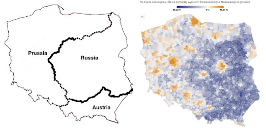
Here are two maps of Poland. The map on the left shows the partitioned Poland of 1815–1918 (from Lessons from the Partitions of Poland). The map on the right is Polish newspaper Gazeta Wyborcza's interactive map of this week's 2025 Polish Election.

It has long been a tradition, after every Polish election, for observers to note that current voting patterns in the country still seem to follow the country's old imperial borders. Back in 2013, Irena Grosfeld and Ekaterina Zhuravskaya wrote that the spatial pattern of the 2007 Polish election was “determined, to a large extent, by the Partitions of Poland (1772–1918).” In The Past in the Polish Present, the two professors argue that the very different economic and social policies pursued by Russia, Prussia, and Austria during their control of Polish territories for over a century have left a persistent legacy. This legacy once again appears to have been evident in this week’s Polish election.

In Do Poland’s 19th-century partitions still influence elections today?, Katarzyna Skiba takes a closer look at this apparent connection between modern Polish political beliefs and “the ongoing legacies of empire.” Her examination of Polish politics includes several critiques of what some consider an overly simplistic comparison.

Via: Datawrapper's Data Viz Dispatch


Tuesday, June 03, 2025

Hunger Maps

The Hunger Map by the Food and Agriculture Organization (FAO) of the United Nations is a visual tool that illustrates the prevalence of undernourishment across the world. It visualizes the geographic distribution of hunger and helps monitor global food insecurity trends.

Hunger Map allows users to explore data across multiple geographic scales, including countries, subregions, and regions, providing a comprehensive view of where hunger is most prevalent and how it varies across different parts of the world. The Hunger Map also includes two main views 'Undernourishment' and 'Food Insecurity', and a timeline. The map’s timeline is set to a three-year average, which helps smooth out annual fluctuations and provide a more stable picture of food insecurity. This approach is particularly useful for assessing long-term trends and guiding policy decisions based on sustained patterns rather than temporary spikes or declines.

The World Food Programme's (WFP) HungerMap Live is a real-time, interactive visualization of hunger and food insecurity across 94 countries. At its core, the map highlights the prevalence of insufficient food consumption, using a color-coded system where red indicates areas of severe hunger and green shows relatively food-secure regions. 

The WFP map also shows levels of acute and chronic malnutrition, and the risk of inadequate micronutrient intake, offering a multidimensional view of food security. Beyond food consumption data, the map integrates key drivers and contextual factors such as conflict, climate hazards, and economic indicators like inflation, exchange rates, and trade balances. 

In regions where direct data collection is limited, WFP uses machine learning models trained on historic and environmental data to generate predictive estimates of food security. These estimates are updated frequently using inputs like rainfall, vegetation levels, and market conditions. This combination of actual and predicted data enables a dynamic, detailed understanding of hunger trends, helping humanitarian organizations and governments make more timely and informed decisions to respond to crises.

Monday, June 02, 2025

The Start of Hurricane Season

Hurricane season in the Atlantic Ocean officially begins on June 1 and ends on November 30 each year. The peak of hurricane activity typically occurs from mid-August to late October, with September 10 often cited as the statistical peak of the season. During this time, meteorologists and emergency planners closely monitor tropical systems and prepare for potential impacts to the U.S., Central America, the Caribbean, and parts of Canada.

To coincide with the start of the 2025 hurricane season, 157mph.com has released a new series of annual and decade-based hurricane maps. The Season Data maps allow users to view all hurricane tracks for each year since 2000, while the Decade maps provide historical context with storm data going back to the 1850s. For example, the animated GIF at the top of this post cycles through the hurricane tracks from each year in the 1990s.

On the yearly maps, users can explore all hurricane tracks for a specific year, with the ability to filter by storm type (hurricanes, tropical storms, or tropical depressions), landfall status, or individual storm name. Each track includes circular timestamps that can be clicked to reveal wind speed and atmospheric pressure at that specific point. These circles are color-coded to indicate the storm category at each timestamp.

You can discover how many hurricanes have passed near your home over the decades using StarNews’s Hurricanes that passed near me map. Simply enter your address to view the tracks of all hurricanes and tropical storms that have occurred near your location since the mid-19th century.

NOAA’s Historical Hurricane Tracks map also provides access to global hurricane data dating back as far as 1842. Using this interactive tool, you can search and visualize hurricane tracks by storm name, location, or date. For example, entering a storm like Hurricane Sandy (2012) displays its full track on the map. Data points along the track allow you to explore daily details such as wind speed and atmospheric pressure.

NOAA’s database includes records for more than 13,000 storms.

Saturday, May 31, 2025

Is it Hot Right Now?

Is the UK hot right now? is a new interactive map that displays live, hour-by-hour temperatures across the country and shows how these temperatures compare to the historical average.

On the map, colored numbered markers indicate how much the current temperature is above or below the average at various locations. Clicking on a location’s marker opens a chart showing all recorded temperatures at that site since 2000. This chart includes a line representing the mean temperature, along with an evaluation of how the current temperature compares to the long-term average.


The UK version of the temperature comparison map was inspired by the Australian website Is it hot right now?. The concept offers a powerful visualization of climate data, and by comparing current temperatures with historical norms, it succeeds in making global warming feel far more tangible and relatable.

Is it hot right now? has proven to be a compelling, data-driven communication tool in the climate change conversation, prompting versions to emerge in other countries. In addition to the Australian and UK versions, there is a Spanish version - Es hoy un extremo? - and a German version - Ist es heiss? - (limited to the city of Bochum).

Friday, May 30, 2025

How the US Arms the Mexican Drug Cartels

There are only two gun stores in Mexico, and both are located on military bases. Yet the country still suffers from a major gun homicide problem. So where are the guns coming from?

In 2015, a Mexican military helicopter was shot down by cartel fighters using a Browning machine gun and a Barrett .50-caliber rifle. Both weapons were traced back to legal purchases in U.S. gun shops. This stark example highlights a brutal reality: Mexico’s gun violence crisis is fueled by American guns.

Mexico’s biggest challenge is that it shares a border with a country where almost anyone can legally purchase a gun. A significant number of these firearms are then trafficked across the border, primarily into the hands of violent drug cartels. According to The Conversation, an estimated 135,000 guns are smuggled annually from the U.S. into Mexico.

The Conversation, in Mexican drug cartels use hundreds of thousands of guns bought from licensed US gun shops, has been investigating the flow of illicit weapons trafficked from the U.S. to Mexico. The map at the top of this post shows that the majority of the firearms trafficked to Mexico came from cities and small towns that are close to the Mexican border. The article also features an interactive map showing the widespread presence of drug cartels across Mexico. This visual data underscores that trafficked American guns are contributing to violence in nearly every region of the country.

The gun violence crisis in Mexico cannot be fully understood without acknowledging the role of the United States as a major source of illicit firearms. While Mexico maintains some of the strictest gun control laws in the world, they are undermined by the easy availability of weapons just across the border. This cross-border flow of guns from the United States empowers criminal organizations, destabilizes communities, and fuels a cycle of violence that affects both nations.

Thursday, May 29, 2025

Belt & Road vs TACO

In 2013, China launched its Belt and Road Initiative (BRI) to boost trade with the rest of the world. Today, China is the world’s largest trading nation.

A key component of the BRI has been major investments in strategic overseas ports and airports. The Council on Foreign Relations has tracked these developments through two interactive maps:

These maps highlight the global reach of China’s infrastructure investments, showing the locations of ports and airports with Chinese investment or partial ownership. In total, 129 ports worldwide now have some degree of Chinese ownership, and 46 airports have received Chinese investment.

China’s overseas port and airport investments reflect the broader ambition of the Belt and Road Initiative - to reshape global infrastructure in ways that advance both its economic and strategic objectives. While these projects can bring development opportunities, they also raise important concerns about ownership, sovereignty, and influence. The Council on Foreign Relations’ maps reflect these complexities, particularly through assessing each port's suitability for use by the Chinese military.

While China expands its global reach through the Belt and Road Initiative, the United States’ trade policy has taken a more erratic turn. Some Wall Street traders have dubbed it “TACO”,  short for “Trump Always Chickens Out”, a reference to the pattern of aggressive tariffs being announced, only to be walked back or removed shortly afterward. This inconsistency stands in stark contrast to the long-term infrastructure strategy China is pursuing.