Saturday, May 31, 2025

Is it Hot Right Now?

Is the UK hot right now? is a new interactive map that displays live, hour-by-hour temperatures across the country and shows how these temperatures compare to the historical average.

On the map, colored numbered markers indicate how much the current temperature is above or below the average at various locations. Clicking on a location’s marker opens a chart showing all recorded temperatures at that site since 2000. This chart includes a line representing the mean temperature, along with an evaluation of how the current temperature compares to the long-term average.


The UK version of the temperature comparison map was inspired by the Australian website Is it hot right now?. The concept offers a powerful visualization of climate data, and by comparing current temperatures with historical norms, it succeeds in making global warming feel far more tangible and relatable.

Is it hot right now? has proven to be a compelling, data-driven communication tool in the climate change conversation, prompting versions to emerge in other countries. In addition to the Australian and UK versions, there is a Spanish version - Es hoy un extremo? - and a German version - Ist es heiss? - (limited to the city of Bochum).

Friday, May 30, 2025

How the US Arms the Mexican Drug Cartels

There are only two gun stores in Mexico, and both are located on military bases. Yet the country still suffers from a major gun homicide problem. So where are the guns coming from?

In 2015, a Mexican military helicopter was shot down by cartel fighters using a Browning machine gun and a Barrett .50-caliber rifle. Both weapons were traced back to legal purchases in U.S. gun shops. This stark example highlights a brutal reality: Mexico’s gun violence crisis is fueled by American guns.

Mexico’s biggest challenge is that it shares a border with a country where almost anyone can legally purchase a gun. A significant number of these firearms are then trafficked across the border, primarily into the hands of violent drug cartels. According to The Conversation, an estimated 135,000 guns are smuggled annually from the U.S. into Mexico.

The Conversation, in Mexican drug cartels use hundreds of thousands of guns bought from licensed US gun shops, has been investigating the flow of illicit weapons trafficked from the U.S. to Mexico. The map at the top of this post shows that the majority of the firearms trafficked to Mexico came from cities and small towns that are close to the Mexican border. The article also features an interactive map showing the widespread presence of drug cartels across Mexico. This visual data underscores that trafficked American guns are contributing to violence in nearly every region of the country.

The gun violence crisis in Mexico cannot be fully understood without acknowledging the role of the United States as a major source of illicit firearms. While Mexico maintains some of the strictest gun control laws in the world, they are undermined by the easy availability of weapons just across the border. This cross-border flow of guns from the United States empowers criminal organizations, destabilizes communities, and fuels a cycle of violence that affects both nations.

Thursday, May 29, 2025

Belt & Road vs TACO

In 2013, China launched its Belt and Road Initiative (BRI) to boost trade with the rest of the world. Today, China is the world’s largest trading nation.

A key component of the BRI has been major investments in strategic overseas ports and airports. The Council on Foreign Relations has tracked these developments through two interactive maps:

These maps highlight the global reach of China’s infrastructure investments, showing the locations of ports and airports with Chinese investment or partial ownership. In total, 129 ports worldwide now have some degree of Chinese ownership, and 46 airports have received Chinese investment.

China’s overseas port and airport investments reflect the broader ambition of the Belt and Road Initiative - to reshape global infrastructure in ways that advance both its economic and strategic objectives. While these projects can bring development opportunities, they also raise important concerns about ownership, sovereignty, and influence. The Council on Foreign Relations’ maps reflect these complexities, particularly through assessing each port's suitability for use by the Chinese military.

While China expands its global reach through the Belt and Road Initiative, the United States’ trade policy has taken a more erratic turn. Some Wall Street traders have dubbed it “TACO”,  short for “Trump Always Chickens Out”, a reference to the pattern of aggressive tariffs being announced, only to be walked back or removed shortly afterward. This inconsistency stands in stark contrast to the long-term infrastructure strategy China is pursuing.

Wednesday, May 28, 2025

Taxing for War

The average American spends nearly $3,000 a year funding the military. In contrast, if those Americans lived in Haiti, they would contribute just $1.70 per year to military spending.

The World BEYOND War's Mapping Militarism project presents a series of maps that illustrate how much individual countries spend on their militaries. The site’s “Money” map includes two key views: one showing the total military expenditure of each country and the other displaying per capita military spending. Both views offer a compelling way to compare global military budgets.

In 2024, the United States spent approximately $997.31 billion on its military - an amount that far surpasses the spending of any other country. By comparison, China, which has the second-largest military budget, spent $313.66 billion. However, when it comes to per capita spending, Israel ranks first, with an average of $4,988 per citizen. The United States follows, at $2,895.10 per person.

This disparity highlights not only the vast scale of U.S. and Israeli military investments but also the priorities and impacts of military funding across different societies.

Tuesday, May 27, 2025

The Largest Gathering in Human History

The Maha Kumbh Mela is one of the largest religious gatherings on Earth. It is a Hindu pilgrimage festival that occurs every 12 years. The 2025 Maha Kumbh Mela, held in Prayagraj, was particularly significant because it was a “Maha Kumbh”, an event that takes place only once every 144 years, due to a rare celestial alignment.

During the 2025 Maha Kumbh Mela, an estimated 663 million pilgrimages were made over a 45-day period. That’s equivalent to the combined populations of Russia, Japan, Vietnam, Brazil, Italy, and Australia. In fact, according to Reuters, “If this amount of people formed their own country, they would be the third largest behind China and India.”

It’s hard to envision the sheer number of people who attended this year’s Kumbh Mela in Prayagraj. However, Reuters attempted to visualize it. In their feature Faith in numbers: The unprecedented scale of India’s Maha Kumbh festival, the news agency used satellite imagery to explore the vast site of the gathering. The imagery takes viewers on a visual tour of the Ganges River and several key pilgrimage locations - including the site where 30 pilgrims tragically lost their lives in a stampede on January 29.

Reuters also uses flower petals as a creative way to illustrate the massive scale of attendance. During the festival, flower petals are traditionally showered on devotees and used to welcome spiritual leaders. In Reuters’ visualization, one petal represents 10,000 people. These petals are grouped into squares, each symbolizing 1 million people, to represent the 663 million pilgrimages. Let’s just say - it takes quite a bit of scrolling to see the full 663 million in the Reuters' visualization.

Monday, May 26, 2025

Unlocking Google’s Hidden Maps

Google's My Maps is a free tool that allows users to create custom maps. It's particularly useful for planning trips, visualizing geographic data, or sharing directions and locations with others.

Given the popularity of My Maps, there are likely millions of maps containing valuable local knowledge created by users around the world. Unfortunately, Google does not provide a centralized directory or searchable index of all public My Maps. While some public maps are technically indexed by Google, they are not easily discoverable through standard search methods.

This is where mapShare steps in - to fill in what the developers believe is a major gap. mapShare is a new platform designed to help users share and discover custom Google Maps. It acts as a community-powered discovery engine for My Maps, allowing users to tap into the vast but often hidden world of public custom maps.

🔍 Search by Location or Subject

You can use mapShare to search for maps based on either geographic location or topic. Whether you're looking for coffee shop guides in Tokyo, historical walking tours of Edinburgh, or national park maps in the U.S., mapShare makes it much easier to uncover useful and relevant maps created by Google's My Maps users.

📂Create and Curate Lists

Found a bunch of amazing maps about cycling in Europe or vegan eats in New York? With mapShare, you can create your own lists of favorite maps, organized however you like. These lists become personal libraries of curated knowledge - ideal for trip planning, research, or just collecting inspiration.

👥 Share With Friends and Family

Planning a group trip? Exploring your city with a partner? With mapShare, you can share your map lists with others, via a direct link or through social media, making it easy to collaborate or simply pass along helpful info.

Drawbacks

At the moment, when I search my neighborhood on mapShare, I’m met with a "results not found" message. This highlights one of the current drawbacks of relying on the crowd to curate Google’s My Maps. As an early adopter of mapShare, you may also encounter gaps in coverage - gaps that will only begin to close as the platform gains more users and contributions.

Saturday, May 24, 2025

The Google Maps Platform Awards

To mark two decades of mapping innovation, Google has announced the Google Maps Platform Awards, a new program created to celebrate the developers and innovators who have shaped the digital mapping landscape over the past 20 years. For those who build with geospatial tools, APIs, and data this is your opportunity to showcase your best work.

Google aims to recognize the impact that developers have made with an awards program designed specifically for the community that made it possible. Submissions are now open for both new and past projects, and the deadline for submissions is 31st July. 

Submit your projects on Devpost.

A range of prizes is on offer for award winners, including physical trophies, digital badges, promotional opportunities, and some exclusive Google Maps swag.

You can learn more about the Awards, the ten award categories, and how to enter on the Google Maps Platform website.

Friday, May 23, 2025

Underwater Weather Forecasts

Current Map by Current Map is a powerful tool for visualizing ocean dynamics. This interactive map uses animated streamlines to depict tidal currents in coastal areas of the United States, offering high-resolution, real-time, and forecasted ocean current data. It's a practical, visually striking resource for sailors, scientists, and anyone with an interest in the ocean’s ever-changing tidal forces.

Animated streamlines are often used on interactive maps to visualize real-time and forecast wind currents. This is the first time I've seen them used for actual water currents. The use of animated streamlines on a map was I believe first demonstrated on Fernanda Viégas and Martin Wattenberg's Wind Map. Cameron Beccario further developed the concept by utilizing animated streamlines on a fully interactive map in his popular Earth Nullschool visualization of global weather conditions.

Behind the scenes of Current Map, sophisticated physics models simulate real-world ocean conditions, taking into account factors like tides and wind forcing to produce accurate short-term forecasts. Users of the map can explore these tidal forecasts directly in their browser, or download GRIB files for use with navigation software, making the data accessible even when offline. 

Thursday, May 22, 2025

Is Flying Becoming More Dangerous?


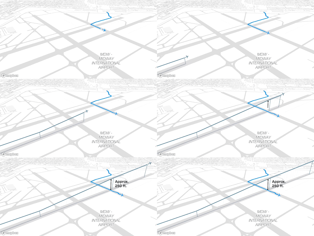
CNN has used the Mapbox mapping platform to create a number of impressive animated mapped visualizations of recent 'plane close calls' at major U.S. airports. These animations are part of the interactive article Visualizing airplane safety: Are close calls and crashes really that common?, which investigates recent aviation incidents and public concerns about flight safety.


One of the most striking features of CNN’s visual storytelling is the use of Mapbox’s 3D tilt setting, which provides an oblique, dynamic viewpoint of each incident. This allows viewers to see aircraft movements not just across the map, but also through vertical space - highlighting changes in altitude, flight paths, and the proximity between planes. The animations use real flight data to reconstruct moments when aircraft came dangerously close to one another, often just seconds or hundreds of feet apart. These visualizations very effectively translate the technical aviation data into a clear picture of what would otherwise be mere abstract descriptions.

If you are concerned about whether flying is becoming more dangerous, CNN ultimately concludes that the underlying data does not support an increase in plane crashes or close calls. While the visualizations may appear alarming, the article reminds readers that these incidents are still statistically rare, and commercial air travel remains one of the safest modes of transportation. 

Wednesday, May 21, 2025

Map Any Event in History (or Fiction)

The Battle of Hastings mapped by th Map Simulation Platform

The Map Simulation Platform is a hugely ambitious project that uses AI to simulate text prompts in 3D on an interactive map. It employs natural language processing to interpret a prompt and render it on a geographical canvas. It's similar to a text-to-image AI tool, except here the output is a dynamic, map-based scenario rather than an AI generated image.

Using the tool, you can simulate historical events such as the Battle of Hastings, the Battle of Goose Green, or virtually any other historical event you'd like to see replayed on a map. It's also possible to simulate hypothetical scenarios, such as an earthquake in New York or a global nuclear war.

The Map Simulation Platform clearly has enormous potential as a tool for chronologically simulating important historical events. At present, it does a commendable job of extracting locations from historical narratives, geolocating them accurately, and plotting them on the map. However, from the examples I’ve explored so far, the playback options can feel a little chaotic, making it difficult to follow the sequence of events in a clear, chronological order.

One improvement that would greatly enhance the experience is the ability to view the timeline of a simulated historical event in distinct stages. If users could move forward and backward through the timeline using simple navigation buttons - and see an information window explaining and contextualizing each stage - it would make the platform a truly powerful historical tool. Allowing users to edit and expand on these events would also be essential for users who want to share their simulations. This would enable corrections of any AI “hallucinations” or factual inaccuracies, as well as the addition of missing but important events.

The platform does already offer the ability to download simulation data as a GeoJSON file. This means that users proficient with popular mapping platforms can export simulation data and build their own guided maps for historical events - adding customized context or supplementing any missing information.

Tuesday, May 20, 2025

Where Americans Live

There are 3,144 counties in the United States, but the population is far from evenly distributed among them. In fact, half of the U.S. population lives in just 144 counties, while the other half is spread across the remaining 3,000 counties.

This imbalance is neatly visualized in an interactive map created by Kyle WalkerCounty Population Share uses data from the 2024 U.S. Census Bureau Population Estimates to generate an animated map that adds counties in order from most to least populated. As the animation unfolds, it's fascinating to watch the densely populated East and West Coasts fill in first, while the less populated counties of the Midwest appear only towards the end of the animation.

There is potential for this map to evolve into a more comprehensive visualization of U.S. population density. One obvious enhancement would be to provide users with access to the underlying data. Currently, hovering over a county reveals its name. It would be a simple yet valuable improvement to display additional information when a county is clicked - for example, its total population and the percentage of the U.S. population that resides there.

It could also be beneficial to enable users to create their own visualizations by interacting with the map. While this would require more development work, it should be possible to allow users to select and deselect counties to see the cumulative percentage of the U.S. population represented. For instance, users could select all the counties in a specific state to reveal the percentage of the national population living in that state.

Monday, May 19, 2025

The Atlas of Drowned Towns

I wasn’t able to find Atlantis on the Atlas of Drowned Towns. That’s probably because it only maps ‘communities that were displaced or disappeared to make way for ... reservoirs ... (and) large dams’ since 1860.

The map does, however, show the location of St. Thomas, Nevada, which was submerged under 60 feet of water in the 1930s during the construction of the Hoover Dam.  It also reveals the locations of hundreds of other towns, villages, homesteads, and Tribal homelands lost to dam construction across the United States and around the world.

The Atlas of Drowned Towns is a digital public history project that asks a deceptively simple question: What was there before the water came? In answering it, the project uncovers the deeply human costs of twentieth-century river development. As massive dams reshaped landscapes for hydroelectric power, irrigation, and flood control, entire communities were erased from maps - and often, from memory.

The project started with a focus on the Pacific Northwest, but it is expanding to include drowned towns across North America and beyond. Its interactive map and growing archive allow users to explore these sites through photographs, historical documents, personal stories, and even aerial imagery that shows what was lost.

If you or someone you know has a connection to a drowned place, the project wants to hear from you. The Share Your Story feature allows users to contribute memories, photos, artifacts, and insights, helping to fill gaps in the historical record and ensure these submerged stories are not forgotten.

Via: weeklyOSM

Saturday, May 17, 2025

The Meaning Behind Our Place Names

Have you ever walked down a street and wondered where its name came from? Was it named after a historical figure, a local landmark, or an ancient word lost to time? The Open Etymology Map helps answer these questions by uncovering the stories behind place names - using data from OpenStreetMap and Wikidata.

🏷 The Etymology Tag in OpenStreetMap

The OpenStreetMap (OSM) project includes an 'etymology' tag that allows users to specify the origin or meaning of a place name. There’s also a related tag, 'etymology:wikidata', which links a feature’s name to a specific Wikidata entity. These tags are used by the Open Etymology Map to reveal the origins of local place names.

🗺 What Is the Open Etymology Map?

The Open Etymology Map is an interactive tool that showcases place names tagged with etymology data in OpenStreetMap. Using the map, you can zoom into any area and view features - streets, neighborhoods, towns - that have an etymology tag. You can then click on any of the highlighted features to learn more about where its name comes from.

For example, in London, if you click on Trafalgar Square, you’ll see a link to the Wikipedia entry for the Battle of Trafalgar, offering insight into the origins of one of the city's most iconic names.

The Open Etymology Map provides a fascinating, crowdsourced window into the history of our streets, offering a glimpse into the meanings behind the names we often take for granted. 

Unfortunately, the etymology tag is still rarely used in OpenStreetMap, which means there are currently large gaps in the Open Etymology Map’s coverage. The good news? You can help fill in those gaps. To contribute, simply research the origins of place names in your neighborhood and add an etymology tag to OpenStreetMap using an OSM editor like  iD.

Friday, May 16, 2025

The Anti-MAGA Protest Mapper

The Protest Mapper is a digital mapping tool designed to help journalists and community members contextualize local protests by visualizing them alongside broader regional or national trends. Using the tool, anyone can quickly create an embeddable, interactive map that displays all local protests occurring within a defined time period.

Created by Rahul Bhargava, a journalism professor at Northeastern University, this tool serves as a practical resource for embedding updated, interactive protest maps into news stories, blog posts, and community websites.

What It Is

Protest Mapper is a free, embeddable, browser-based tool that allows users to generate maps of recent protests within customizable geographic ranges (from 5 to 100 miles). The tool relies on two well-respected data sources: the Armed Conflict Location & Event Data Project (ACLED), which updates weekly, and the Crowd Counting Consortium (CCC), updated monthly. Users can choose between these datasets when generating their maps. Each protest event is marked by a pin that, when clicked, reveals a short summary of the demonstration.

How It Works

The Protest Mapper is designed to be simple and journalist-friendly and modeled after the workflow used in the popular DataWrapper. Users can input a location and select a time range to generate a map of protests, which is then exportable as either an embeddable iframe or a static image (.png). The map itself is lightweight - built with Svelte and hosted on GitHub Pages to keep it sustainable and low-cost. 

Thursday, May 15, 2025

A Panorama of Victorian London

The city of London has inspired many beautiful panoramic maps over the centuries, each lovingly crafted by talented artists. Interestingly, these panoramas almost always share a common perspective - north from the south side of the River Thames. This same viewpoint is used in Frederick James Smyth’s 1844 Panorama of London.

Exeter University’s Digital Humanities Lab has created an interactive guided tour of Smyth’s Panorama of London. Using Knight Lab’s StoryMap.js platform, the project offers a rich, navigable journey through 19th-century London as captured in one of the era’s most visually striking urban illustrations.

Originally commissioned by the Illustrated London News and first published in 1845, Smyth’s panorama is a remarkable feat of Victorian printmaking. Stretching over eight feet in length, it presents a detailed bird’s-eye view of the city from a south-of-the-Thames vantage point.

Exeter University’s story-map guides viewers through some of 1844 London’s most prominent landmarks. These include long-lost sites such as Millbank Penitentiary (where convicts were held before deportation to Australia) and the Hungerford Suspension Bridge. It also features familiar icons that remain central to the city today, including St. Paul’s Cathedral, the Houses of Parliament, and Buckingham Palace, to name just a few.

More vintage panoramas of London:

1543 - The Wyngaerde Panorama
1616 - Claes Jansz Visscher's Panorama (1848 copy)
1829 - View of London from the Adelphi

Wednesday, May 14, 2025

Europe in Drought

Spring 2025 has been exceptionally dry in Europe, with nearly every country affected by drought. To help monitor the increasing threat of drought due to global heating, the European Environment Agency (EEA) has launched a new interactive drought map. Updated monthly, the tool provides near real-time insights into drought conditions across the EEA’s 38 member and cooperating countries.

The Drought Conditions Map currently shows that around 38% of the mapped area experienced drought between 11–20 April 2025. It highlights severe impacts across much of northern and eastern Europe during April. An accompanying pie chart reveals that 15% of European cropland was exposed to drought in the same period.

The map features multiple data layers, allowing users to track drought effects across different ecosystem types, including cropland, grassland, heathland, wetland, and urban areas in the 38 countries covered.

The European Drought Observatory (EDO) map includes the UK in its assessment of European drought conditions, where extremely dry weather is also being observed. The latest data reflects conditions from the last ten days of April 2025.

Currently, 31.3% of the monitored area is under ‘Warning’ status. The EDO cautions that if these conditions continue, impacts on vegetation are likely to become apparent in the coming months. Many European rivers are already reporting abnormally low water levels, raising concerns for ecosystems and water supplies.

Tuesday, May 13, 2025

Mapping Your Future Climate Risks

The Natural Hazards Index Map, developed by climate experts at Columbia University’s National Center for Disaster Preparedness, is a new interactive map that visualizes how and where climate change is increasing risks from natural disasters across the U.S.

What Hazards Does It Show?

The map focuses on 14 different types of natural hazards, with a special focus on those getting worse due to climate change. Some of the main ones include:

  • Wildfires
    Example: San Diego and Yakima County in Washington are expected to see a much higher risk of wildfires. Even areas like the Dakotas, which don’t see many fires today, may see more in the future.

  • Tornadoes
    Tornado activity is shifting eastward, away from the traditional Tornado Alley and toward the East Coast.

  • Flooding and Sea Level Rise
    As some areas receive more rainfall, the flood risk will rise, especially in places like Louisiana.

  • Extreme Heat, Hurricanes, and Tropical Storms
    These threats are also expected to worsen as global temperatures climb.

Unlike traditional hazard maps, this tool doesn’t just display current risks, it forecasts future changes, helping agencies and policymakers plan long-term resilience strategies. The platform also includes a resources page with links to preparedness guides, making it a practical tool for community safety planning.

Monday, May 12, 2025

The 2024 Sea-Level Rise Map

The 2024 U.S. Sea Level Report Cards from the Virginia Institute of Marine Science (VIMS) reveal that Gulf Coast states, particularly Louisiana and Texas, continue to experience some of the fastest rates of sea-level rise in the country.

Published annually, the VIMS sea-level report uses observed tide gauge data to track sea-level trends across the United States and project future changes based on this long-term record. This year’s edition debuts a sleek, user-friendly interactive map that compiles data from 35 coastal communities, offering localized insights and projections through 2050.

A key finding in this year’s report is the accelerated sea-level rise now being observed in the southeastern U.S., including Georgia and South Carolina. Along the East Coast, sea levels are rising steadily, driven in part by meltwater redistribution from the Greenland ice sheet. Meanwhile, much of the West Coast has shown unexpected stability, defying earlier predictions.

The VIMS dashboard is grounded in over 55 years of tide-gauge measurements from locations stretching from Alaska to Florida. This long-term dataset allows for precise tracking of both historical trends and accelerating rates of sea-level change at each site.

Each report card includes monthly sea level averages, notes short-term anomalies like storm surges, and incorporates longer-term climate influences such as El Niño. Importantly, the projections factor in observed acceleration and compare future water levels under both linear and accelerating scenarios, providing a range of possibilities within a 95% confidence interval to aid coastal planning and risk management. 

You can explore sea-level rise projections for other countries (as well as additional regions within the United States) using the Climate Change Sea-Level Map. Climate Risk’s Coastal Risk Map also lets you assess your flood risk based on projected sea-level rise, coastal flooding, elevation, and specific timeframes. By sharing your location with the map, you can view potential flood risks for different years and sea-level scenarios.

Saturday, May 10, 2025

The W3W Cryptic GeoGuessing Game

Pin the Tale is an interactive storytelling game that uses the What3Words geolocation system as its foundation. Webcurios describes Pin the Tale as “a combination of cryptic crosswords and Geoguessr,” while the creators themselves call it a "treasure hunt."

For those unfamiliar, What3Words is a geolocation addressing system that divides the entire world into a grid of 3 meter by 3 meter squares, assigning each square a unique combination of three random words. Pin the Tale uses these three words as prompts for location-based stories. From these stories, other players must try to work out the exact 3x3 meter square being described, using the clues embedded in the story.

🎮 How to Play Pin the Tale

1. Explore the Map 
  • Open the Pin the Tale map. 
  • Zoom into any location to view stories that users have submitted. 
  • Each story corresponds to a unique 3-word address (a specific 3x3m square). 
2. Read & Discover Stories 
  • Click on a story to read it. 
  • Try to figure out the exact location it’s describing. 
  • Once you think you know the spot, enter the corresponding What3Words address in the answer box to see if you’re correct. 
  • Think of it as a geographical treasure hunt. 
3. Create Your Own Story 
  • Choose a location on the map. 
  • Look up its What3Words address (for example, ///apple.tiger.chair). 
  • Write a short story inspired by that place, incorporating those three words into the story. 
  • Submit it for others to discover and solve. 
Pin the Tale is far more difficult to describe than it is to play. My advice is to just dive in, search for your nearest clues, and try to see if you can solve them.

Friday, May 09, 2025

The Marine Migration Map

tracked migrations of the Green Turtle

Migratory Connectivity in the Ocean (MiCO) is an interactive map visualizing the global migrations of more than 100 species of birds, mammals, turtles and fish. The aim of the map is to bring together knowledge about the migratory routes and connected habitats of marine species, such as marine mammals, seabirds, sea turtles, and fish, in order to help support global conservation efforts.

The MiCO map was compiled by synthesizing decades of animal movement data from over 1,300 scientific studies published between 1990 and 2017. To create the map researchers compiled satellite tracking data from 109 migratory marine species, including seabirds, whales, sea turtles, and fish, collected through animal-borne tags that record and transmit migration routes. These tracking studies, conducted by universities, government agencies, and conservation organizations, have now been aggregated, standardized, and mapped to show key habitats and migratory pathways. 

By bringing together data from over 100 species and 100 studies, MiCO highlights critical corridors and habitats that multiple migratory animals rely on, helping policymakers and conservationists prioritize protection in key areas, especially in international waters where governance is fragmented. It is hoped that MiCO can help foster cross-jurisdictional collaboration, support data-driven policy decisions, and help prioritize conservation actions in both national waters and international seas, where migratory species are most vulnerable yet least protected.

Explore more migratory journey maps through the animal tracking tag

Thursday, May 08, 2025

No News is Bad News

Over 200 counties across the United States now lack a single source of local news. Another 1,500 have only one. As a result, more than 50 million Americans live in what researchers call “news deserts”, areas with little to no access to reliable local reporting.

A new interactive map, developed by the Medill Local News Initiative, provides the most detailed view yet of this crisis. Their Local News Barometer and Watch List, updated in 2025 with new demographic and media data, serves as both a diagnostic tool and a forecast, helping journalists, lawmakers, funders, and citizens understand where local news is dying, and where it might disappear next.

The map includes a Local News Watchlist - a collection of counties identified as having more than a 40% chance of becoming news deserts within the next five years. The latest version, highlights 249 such counties. These at-risk areas are not just underserved - they are, on average, poorer, older, and less educated than even existing news deserts. If you select a state from the map sidebar then the Watchlist will update to show all the counties in the selected state in the most danger of becoming news deserts.

The map’s most sobering takeaway is that America is increasingly becoming two nations when it comes to local news: one with abundant access in affluent, urbanized regions, and another without. The consequences are profound. Research shows that communities without local news experience lower civic engagement, less voter participation, and weaker accountability in public institutions.

Wednesday, May 07, 2025

Serendipitous Street View Fun

Internet Roadtrip

Yesterday, I spent a lot of time virtually exploring cities around the world, guided by StreetWhip's impressive AI technology. Today's serendipitous Street View adventure, however, has been powered by the delightful Internet Roadtrip.

Internet Roadtrip is the latest engaging project from the always entertaining Neal.fun. It takes you on a drive through Google Street View—but with a twist. On this drive, it's the wisdom of the crowd that determines the route. Every ten seconds, Internet Roadtrip presents users with a choice. If we're at a junction, the options might be to turn left, turn right, or go straight ahead. The direction we take is then decided by the votes of the hundreds of people currently playing.

Sometimes, you're not at a junction. In those moments, the voting options might include continuing forward, changing the radio station, or turning the radio off entirely. A small mini-map insert tracks the journey so far, as guided by the crowd’s collective decisions.

When I first played the game yesterday, Internet Roadtrip was meandering through Boston. Today, it's in Norwood, Massachusetts. According to Google Maps, that’s about 23 miles as the crow flies. But with the circuitous route enforced by the crowd’s decisions, I’m sure the actual journey has covered many, many more miles.

Tuesday, May 06, 2025

A Guided Street View Tour of the World

StreetWhip

If you've ever lost an hour (or five) wandering the globe via Google Street View, you’re not alone. There’s something uniquely thrilling about virtually dropping into a faraway town and soaking in the details — the architecture, the people, the colors of everyday life. But what if you could do more than just look? What if you had a knowledgeable, curious local guide whispering in your ear, telling you what you're seeing and why it matters?

Welcome to StreetWhip — a wildly addictive mashup of Google Street View and artificial intelligence that turns virtual wandering into a rich, immersive learning experience. Think of it as a reverse Geoguessr: instead of guessing where you are, StreetWhip tells you where you are, what you’re seeing, and the deeper stories behind it all.

Not Just a Street — A Story

Let’s say you’re standing on a bridge over the Dijver canal in Bruges. To the untrained eye, it’s a scenic view with charming brick buildings lining the water. But click on a StreetWhip link, and suddenly you’re informed:

"That’s the Old St. John’s Hospital, one of the oldest surviving hospital buildings in Europe. Notice the row of smaller arched windows near the bottom? Those illuminated the original wards."

It’s like turning on an X-ray vision for cultural and historical insight. StreetWhip identifies buildings, styles, historical relevance, and even hidden quirks in the environment — all powered by AI that acts like your personal tour guide. It brings a layer of meaning to what would otherwise just be “some random street.”

Why StreetWhip Is So Addictive

What makes StreetWhip so brilliant is that it taps into something deeply human: curiosity. You’re not being led through a pre-designed museum exhibit — you’re exploring, poking around unfamiliar neighborhoods in Japan, Uruguay, or Morocco and then being rewarded with tidbits of local culture, architectural nuance, and historical backstory.

Google Maps Needs Street Whip

StreetWhip is so informative and useful that Google should seriously consider implementing something like it directly into Google Maps. I still fondly remember the Wikipedia layer that unfortunately Google removed back in 2013. StreetWhip feels like its spiritual successor: a smart, engaging map companion for those of us who love learning about the world.


Street View image of London's Houses of Parliament with a transcript of an AI generated narration of the building

Google has actually taken some tentative steps toward implementing an AI travel guide for Street View. Google Talking Tours, a collaboration between the Google Arts & Culture Lab and artist-in-residence Gaël Hugo, is an experimental project that leverages generative audio and Google’s Gemini AI to provide dynamic, location-specific insights about cultural landmarks featured in Street View.

However, unlike StreetWhip, Talking Tours is limited to just 55 major landmarks around the world. It offers an AI-generated audio guide that delivers insights based on the visual content of Street View panoramas. Users can explore a 360-degree view of a site, take a snapshot, and receive detailed commentary from the AI. Additionally, there's an “Ask a Question” button that generates three contextual questions about the location, enhancing interactivity and personalized learning.

Google Talking Tours is a promising start, but it barely scratches the surface of what’s possible. Taking inspiration from StreetWhip — with its deep contextual insights, spontaneous street-level discovery, and playful interactivity — Google could use its Gemini AI to transform Google Maps' vast Street View archive into something far richer: not just a map, but a living, breathing encyclopedia of the world.

Monday, May 05, 2025

The World's Terrorist Hotpots

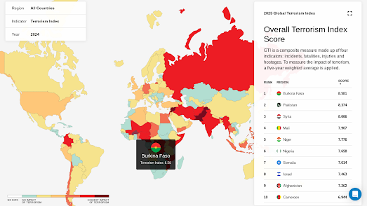
Burkina Faso, Mali, and Niger all rank among the top five countries most impacted by terrorism (Pakistan and Syria are the other two). In fact, the Sahel region of Africa has become the epicenter of global terrorism, accounting for over half of all terrorism-related deaths worldwide. Notably, only seven Western countries appear in the top 50 most affected.

You can explore the full rankings on Vision of Humanity’s Global Terrorism Index. Their interactive map highlights the degree to which each country is impacted by terrorism, with the most affected nations shown in red.

The Global Terrorism Index (GTI) is an annual report that measures the impact of terrorism across 163 countries, representing 99.7% of the global population. Developed by the Institute for Economics & Peace (IEP), the GTI draws from data sources including Terrorism Tracker to produce a composite score for each nation. This score, which ranges from 0 (no impact) to 10 (maximum impact), reflects factors such as the number of terrorist incidents, fatalities, injuries, and property damage in a given year. 

In 2023 the United States experienced a 15-year low in total attacks. However despite this overall drop there has been a sharp 200% rise in anti-semitic attacks. The US also accounted for 76% of terrorism-related deaths in Western democracies.

Saturday, May 03, 2025

Kangaroos Don't Vote - People Do

If ever an election needed a cartogram map, it was the 2025 Australian federal election.

If you were to view The Australian’s Electorate Map - 2025, you could be forgiven for thinking the Liberals had cruised to a landslide victory. This traditional cartogram election map is visually dominated by the blue of the Liberal Party. It also appears as if the Labor Party (shown using salmon pink) made only a few modest gains in the Northern Territory, Tasmania, and a handful of electorates in the southeast of the country.

It just goes to confirm the well-worn cliché: "kangaroos don't vote — people do."

The Guardian’s "Exaggerated" view does a slightly better job of visually representing the large number of urban seats won by Labor in this election. Their Australian election results 2025 map map allows users to toggle between a traditional geographical view and an exaggerated one, in which "smaller electorates are increased in size for visibility."

However, even The Guardian’s exaggerated view still falls short of clearly conveying the full story of the 2025 election - with 82% of the results called, Labor holds 82 seats compared to just 32 for the L/NP Coalition.

ABC News’ Live: Maps show swing to Labor, crash in Coalition vote does an excellent job of illustrating the massive swing to Labor in this election compared to 2022. Using a series of swing arrow maps, ABC visualizes the changes in vote share since the previous election in both the two-party-preferred vote and the primary vote. The screenshot above shows "the change in the two-candidate-preferred vote in each electorate." As you can see, there are far more red arrows — representing a swing towards Labor — than blue arrows — which indicate a swing towards the Coalition.

Friday, May 02, 2025

The Democracy Sausage Map

The 2025 Australian federal election will be held tomorrow, 3 May 2025. One of the most iconic and uniquely Australian traditions on election day is the “democracy sausage.” As voters head to the polls to cast their ballots, many are greeted by the smell of sizzling sausages at local polling places, where community groups and schools run sausage sizzles as fundraisers.

The Democracy Sausage Map is a crowd-powered tool that helps hungry voters find out exactly where they can score a snag (and sometimes cake!) while casting their vote. The map is powered by self-described “crowdsauce” data collected from social media, polling booths, and tip-offs from the great Aussie public.

The map uses different icons to show what’s on offer at each sausage sizzle stall. These include markers for sausages, cakes, vegetarian options, coffee, bacon and egg rolls, and halal choices. When zoomed out, a polling booth may not display the full range of available fare — but zooming in on your local neighbourhood should reveal the full menu.

Thursday, May 01, 2025

Drinking & Eating in the Sun

London is actually having one of its rare weeks in the sun so I have been using Sunseekr to help me find cafes and pubs which are in the sun.

SunSeekr is an interactive map with a sunny twist. The map helps users locate cafés and pubs currently bathed in sunlight, so you can sip your espresso or enjoy your pint while enjoying some rays. What makes Sunseekr shine (pun intended) is the clever integration of real-time sun and shadow simulation with a database of local venues, that allows you to instantly see which cafés and pubs are currently bathed in sunlight and which are in the shade.

SunSeekr uses terrain and building data to calculate where light actually falls at any given moment — not just based on general weather or time of day, but down to the angles and obstructions that might block the sun. The map even comes with a time control so you can plan which cafés and pubs to visit later. 

From a technical perspective, Sunseekr is impressive under the hood. It leverages Mapbox for interactive, global-scale mapping, and layers on tools like Turf.js and a shadow simulation plugin to bring the sun's position into focus in a hyperlocal, real-time way. 


Sunseekr is not an entirely original concept. JveuxDuSoleil is an amazing French interactive map (that has been around for a number of years) which also simulates the location of shadows. If you are looking for the perfect spot to catch a little sun (or escape from the sun) then you can open up JveauDuSoleil and quickly discover which areas will be shaded at any time of the day. In a number of French cities JveuxDuSoleil also shows the locations of restaurants with outdoor terraces — just what you need to find the perfect al fresco dining spot.


Shade Map is an interactive map which allows you to view the location of shadows from the sun throughout the day. Search for any location in the world on Shade Map and the application will show you which local areas are currently in shade. 

At the bottom of the map is a timeline control which allows you to view shadow locations for any time of the day. Drag this time slider back and forth and the map will automatically update to show how the shadows move during the course of the day. If you click on the date then the time control will switch to show months instead of hours of the day. Now you can use the time control to show where shade will fall during the different months of the year. Just click on the time to switch back to showing the hours of the day.


Shadowmap is another interactive 3D map which allows you to view the location of building shadows around the world for any time of day and on any day of the year. 

Shadowmap not only shows you the shadows that will be cast by nearby buildings at any precise moment it also includes an interactive sun ray overlay. This overlay shows you the exact direction of the sun's rays — so you can see for yourself where the sun will be in the sky at any moment of the day.